
 |
| Neville Brody |
 |
| Lennart Wolfert |
What I like about this:
- Ligatures: the way the letters connect to each other even though they're block type letters which typically don't have ligatures
- Colour: two colours separate the words. Colours are complimentary to each other ("colors", whatever)
What I like about this:
- Small block of text fitted around large letters. Small letters become a part of the entire structure
- Difference in sizes of letters
What I like about this:
- Stripes: black and white zebra background doesn't distract from type, gives poster movement
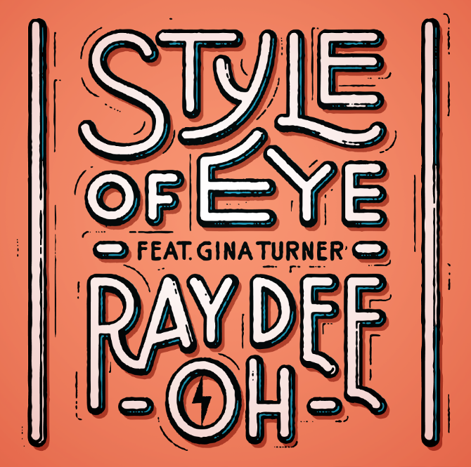
What I like about this:
- Colour: two colours separate the words. Colours are complimentary to each other ("colors", whatever)
 |
| Herb Lubalin |
What I like about this:
- Small block of text fitted around large letters. Small letters become a part of the entire structure
- Difference in sizes of letters
 |
| Gotz Gramlich |
What I like about this:
- Stripes: black and white zebra background doesn't distract from type, gives poster movement
fbarral.png) |
| Fabien Barral |
What I like about this:
- Colorful background behind 'Evoke An' is red and draw attention
- Lots of different patterns and textures in the background but all still unified
What I like about this:
- Letter-spaced characters are solid and 2D, nice contrast with 3D, rounded shapes of object
-White and black contrast with subtle gradient for background
- Last 'letter' constructed with information
 |
| Taylor Pemberton |
 |
| Demian Conrad Design |
 |
| Rachel Rivera |
 |
| Fons Hickman |
What I like about this:
- Letter-spaced characters are solid and 2D, nice contrast with 3D, rounded shapes of object
-White and black contrast with subtle gradient for background
- Last 'letter' constructed with information
 |
| 'I am Love' movie poster |
 |
| Homeboy Sandman album cover |
 |
| V Magazine |
 |
| U&lc Vol.1 |
 |
| Alexandre Bourgois |
 |
| Pornographics |
 |
| Grafician |
 |
| Brian Larossa |
 |
| Herb Lubalin |
 |
| David Martinez |
 |
| Jessica Hische |
 |
| Andre Beato |
 |
| Goncalo Leite |
 |
| Laure Stromboni |
 |
| Miguel Mantila |
 |
| Sagmeister Walsh |
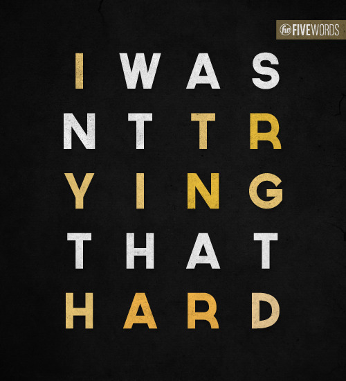 |
| http://www.five-words.com.au/ |
 |
| AIGA covers |
 |
| AIGA covers |
 |
No comments :
Post a Comment